Monday, November 29, 2010

KEC Grad Wear Logo's

The second image of the KEC Grad wear logo which was a lot more suitable and made more sense to have as a logo on a T-Shirt
Grad wear Logo for the first T-Shirt was original but slightly unsuitable

3D Text Project


Yes I can Motivation T-Shirt project

Yes I can T-Shirt project shirt and paragraph.

Audio to visual from 'Moon' Movie Project

This poster represents what I thought of when I heard the soundtrack from the movie 'Moon'

Last Years Show and Shine Project

Show and shine 2010, last years Show and Shine project for the competition.
Vehicle is a nissan skyline R34 completely vectored.

Thursday, October 28, 2010

Cereal Packaging Summary

Kelloggs Variety Pack (10)
Kellogs Variety Pack (30)
Lucky Charms Cereal (toy)
Cap'n Crunch Cereal
Nestle Nesquik Cereal

Reese's Puffs Cereal

All of these Cereal Boxes have lots of things in common to attract young children. A few of the elements in the cereal packaging are colour which is a high priority when it comes to the package design and overall look. Young kids like bright colourful things that look tasty. They make a Theme that matches the main product and it draws children in. It works because then they go running to their parents begging for this delicious looking cereal that they want so bad. Some Cereal even features toys or special surprises inside so the younger group of people will be drawn to it. The fact that you are only able to find the toys in this certain type of cereal boxes makes them want it even more, they then realize that the stores don't sell the toys individually.


Friday, June 18, 2010

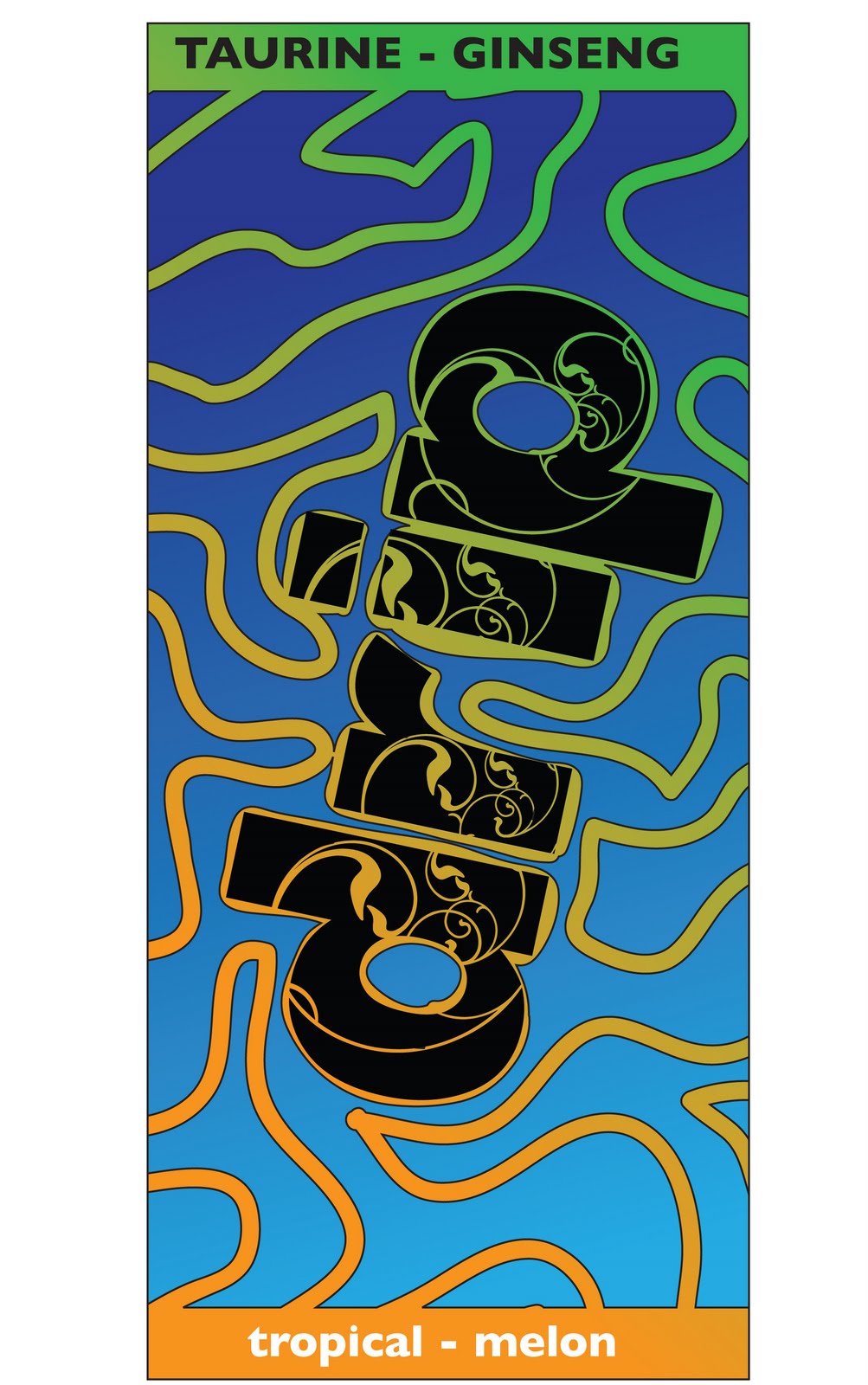
I like this project because you're getting a perspective of the can and your design as one. This is a good learning experience because it puts you in the real world as if you were a designer for a soft drink or energy drink company if they wanted you to design something. Experience on this project would help you out a lot.

Tuesday, April 6, 2010

The Taj Mahal

This project was fun for me because I like using the vector tool in Adobe Illustrator. I didn't do the background the same colour as the picture because I like to be myself. I think it's good to have creativity in your art so that people can reflect and compare how other people do things. I decided to outline the Taj Mahal with a light blue to outline the structure and make it stand out. I chose the black to go wit i because black goes with almost everything.

Wednesday, February 17, 2010

CD Cover

This CD was a project that I decided to try and complete with some art, and I make it look like I know what I am doing. This assignment was easy for me because I am used to designing layout for pages. I like this assignment because I think I did good and I liked the way I designed this CD cover. At the beginning of this project it was hard for me to come up with ideas, but I got used to it.

Thursday, February 11, 2010

Banner Project

I like this project because it was a nice simple signature graphic design. I used to do some signature graphics for a forum site I went on I have experience in this because I like making these. I like this project because it was short and easy. This project describes me very well.

Monday, February 8, 2010